How to Choose a Color Palette for Handmade Party Decorations
A simple way to pick three or four colors plus a neutral for handmade birthday decorations, with a main, second and accent recipe and six palette families to start from.
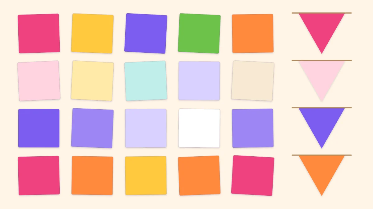
Tutorial at a glance
Materials
- Cardstock or paper in a main color
- Paper in a second color
- A small amount of an accent color
- White, cream or kraft paper as the neutral
- Optional: one patterned or metallic paper
A birthday party color palette does more for handmade decorations than any single clever project. A plain triangle banner, a few rosettes and some round toppers look planned when they share the same three colors, and look like leftovers when each is cut from whatever paper was nearest.
Choosing those colors before buying or cutting anything also saves paper. The ideas below are design suggestions rather than rules, but they give a dependable starting point when a wall of cardstock colors feels like too many options.
Why three or four colors plus a neutral works
Handmade decorations are made of simple shapes repeated many times. With one color, the shapes merge into a block and the room feels flat. With seven or eight, the eye cannot find a pattern and the pieces stop looking related. Three or four colors give enough variety for stripes, layers and alternating pennants while staying easy to recognize from across the room.
The neutral is what holds them together. White, cream or kraft brown gives the eye a rest between brighter pieces and is the natural choice for backing circles, tags, writing panels and string. Twine and plain paper bags already count as kraft, so most palettes include a neutral without any extra effort.
The main, second and accent recipe
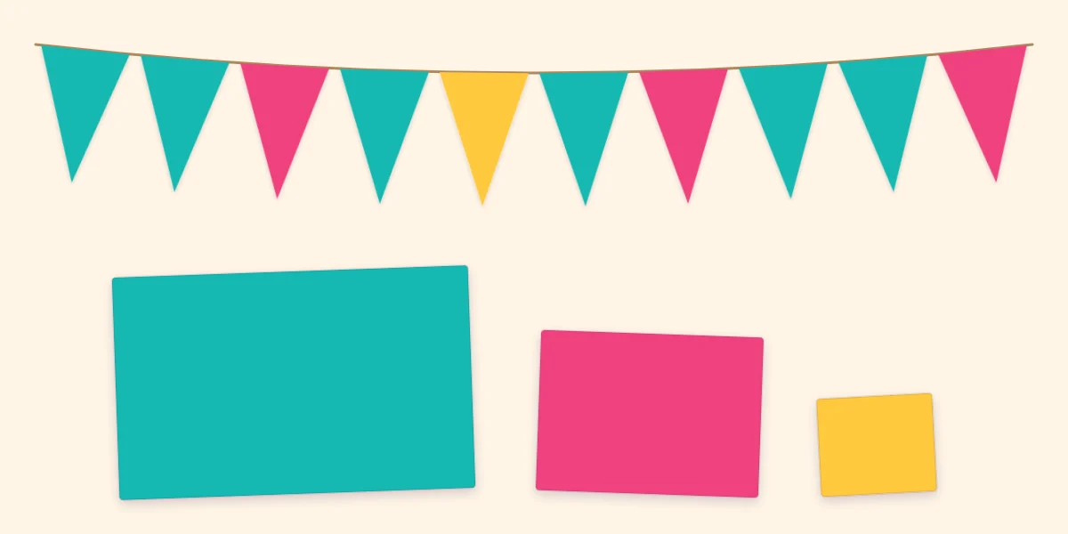
A simple proportion keeps a palette balanced: about 60 percent of the pieces in a main color, about 30 percent in a second color and about 10 percent in an accent. On a banner of ten pennants, that is six in the main color, three in the second and one in the accent.
The picture below shows exactly that split in turquoise, pink and yellow. Turquoise sets the mood, pink supports it, and the single yellow pennant is the spark that keeps the row from looking like a two-color stripe. If all three colors were used equally, none would lead and the banner would look busier.
The percentages are rough guides, not something to measure. The practical version is to buy or pull roughly six sheets of the main color for every three of the second and one of the accent, and to save the accent for small things: a star on a topper, the center of a rosette, one pennant in ten.
Six palette families to start from
Each of these is a family rather than a fixed set, so the exact shades can shift to match the paper available.
| Palette | Main | Second | Accent |
|---|---|---|---|
| Bright primaries | Red | Blue | Yellow |
| Pastels | Pale pink | Mint green | Soft yellow |
| Monochrome | Mid blue | Pale blue | Navy |
| Warm sunset | Pink | Orange | Yellow |
| Cool ocean | Turquoise | Navy | Green |
| Black, white plus one bright | White | Black | Hot pink or yellow |
Bright primaries are bold and cheerful, and plenty of white keeps them crisp. Pastels are soft, so they benefit from white rather than kraft, which can make them look dull. Monochrome, one color in three shades, is the most forgiving choice for a first attempt because the shades cannot clash. Warm sunset colors sit next to each other on the color wheel and blend into each other, which suits fringe and layered pieces. Cool ocean is calm and works well with kraft. Black, white plus one bright is graphic and modern; stripes and dots carry it.
Some themes bring their own colors. A full spectrum needs different handling, covered in the guide to rainbow party crafts, and a dark background with a few bright colors is the basis of the space party crafts set.
Start from something fixed
A palette is easier to build around one thing that is already decided than from nothing. Three good anchors:
- The birthday person’s favorite color. Make it the main color, then pick a second that sits beside it on the color wheel for a calm look, or opposite it for a livelier one.
- The tablecloth or the room. A patterned cloth or a strongly colored wall is part of the palette whether intended or not. Pull two colors from it and add one accent.
- The paper already in the drawer. Lay out every sheet, group the ones that look good together, and buy only what fills the gap.
Check the colors together before cutting
Paper colors look different beside each other than they do alone. Before cutting anything, lay a sheet or a strip of each color side by side, overlapping slightly, in the proportions planned: a wide band of the main color, a narrower band of the second and a thin strip of the accent.
Then look at the stack from a few steps back, in the room where the party will be if possible, in both daylight and lamplight. Two warning signs are easy to spot. If two colors are so close in lightness that they blur into one from a distance, swap one for a lighter or darker shade. If one color seems to jump forward and shout, give it the accent role instead of a larger share.
Tip
Squint at the laid-out papers. Squinting removes detail and shows whether the colors differ enough in lightness to read as separate shapes across a room.
Where metallic and patterned paper helps
Metallic paper acts as an accent, not as one of the main colors. A gold or silver star, a rosette center or one pennant in ten adds sparkle. A whole banner in foil paper reflects the room and loses its shape in photos.
Patterned paper helps when its colors come from the palette and its pattern is simple: stripes, dots or a small check. It fights when it introduces colors that appear nowhere else, or when two different busy patterns sit side by side. A safe approach is one pattern per palette, used in place of part of the second color, with solid colors on either side of it.
Watch out
Colored paper varies from pack to pack. Buy enough of the main color in one go, because a second pack may not match the first.
Repeat the palette across the room
A palette only works if it turns up everywhere. The same three colors on the banner, the table and the favors tie the room together even when the projects themselves are very different. Keep the proportions roughly the same too: if turquoise leads on the wall, it should lead on the table.
The simplest way to manage that is to cut pieces for several projects from the same sheets in one session. Offcuts from a paper pennant banner become topper circles and tag layers, so the colors match exactly. For deciding where those pieces go, the guide to planning handmade decorations for a whole room breaks the space into zones.
Frequently asked questions
How many colors should party decorations have?
Three or four colors plus a neutral such as white or kraft is a dependable range for handmade decorations. It gives enough variety for stripes and layers while the pieces still look related. Fewer can look flat, and many more can look unplanned.
What is the 60-30-10 idea for party colors?
It is a rough proportion: about 60 percent of the pieces in a main color, 30 percent in a second color and 10 percent in an accent. On a ten-pennant banner that means six, three and one. It is a guide for balance, not a measurement.
Can metallic paper be part of the palette?
Yes, as an accent. Small pieces such as stars, rosette centers or one pennant in ten add sparkle, while large areas of foil paper reflect the room and lose their shape in photos.